© 2025
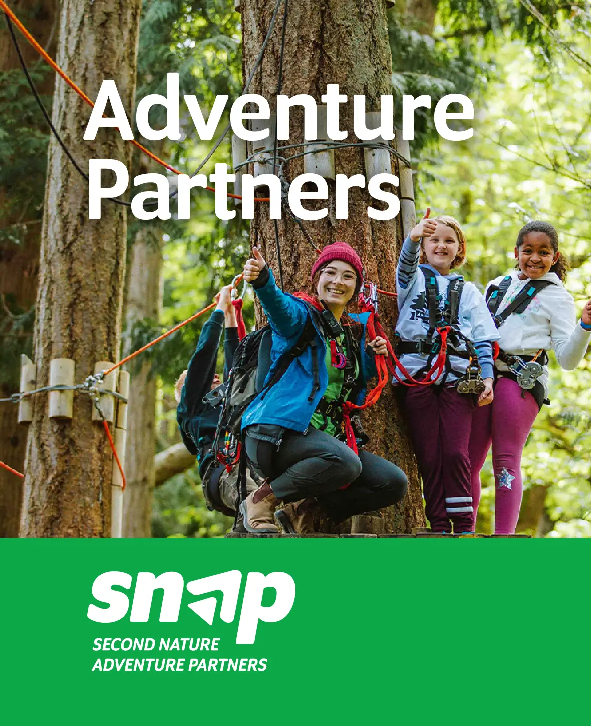
Snap Brand Guidelines:
Second Nature Adventure Partners
In this section, we delve into the essence of our brand, the values and principles that define who we are and how we present ourselves to the world. Discover the audience we connect with, the position we hold in the market, and the personality that sets us apart.
Brand Guidelines Overview
Our brand guidelines are designed to ensure consistency and coherence in our branding efforts across all channels and touchpoints. By following these guidelines, our team can maintain the integrity of our brand identity and effectively communicate our values and personality to our audience.
These guidelines cover everything from our logo usage and color palette to our tone of voice and imagery guidelines. They serve as a comprehensive resource for anyone involved in creating content or representing Brandguide in any capacity.
Brand Positioning
Brandguide is positioned as a boutique branding agency that combines creativity with strategy to help businesses stand out and succeed in competitive markets. Unlike larger agencies, we offer a hands-on approach and personalized service, ensuring that each client receives the attention and expertise they deserve.
Our focus on collaboration and creativity sets us apart from competitors, allowing us to deliver innovative solutions that drive results for our clients.
Tone Of Voice
Brandguide's voice is professional yet approachable, knowledgeable yet empathetic. We strive to communicate with clarity and confidence while maintaining a human touch that resonates with our audience. Whether we're crafting website copy, social media posts, or client communications, our tone is consistent and authentic. We speak directly to our audience, addressing their needs and aspirations with empathy and understanding.
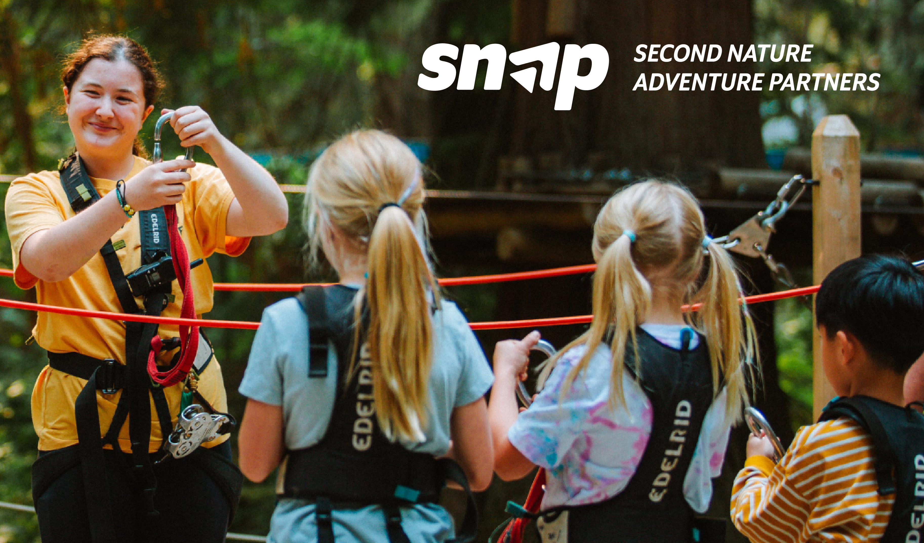
Snap Visual Identity
In this section you'll discover the backstory of our logo's creation, the symbolism embedded in its design, and the guidelines ensuring its consistent and effective usage across platforms.
The logo
The logo contains a sleek and sophisticated wordmark, embodying our commitment to clarity and professionalism in all endeavors. The logo symbol resembles the letter "A," an homage to Adventure. This symbol evokes the imagery of a signal, like a compass needle pointing to possibility and discovery.

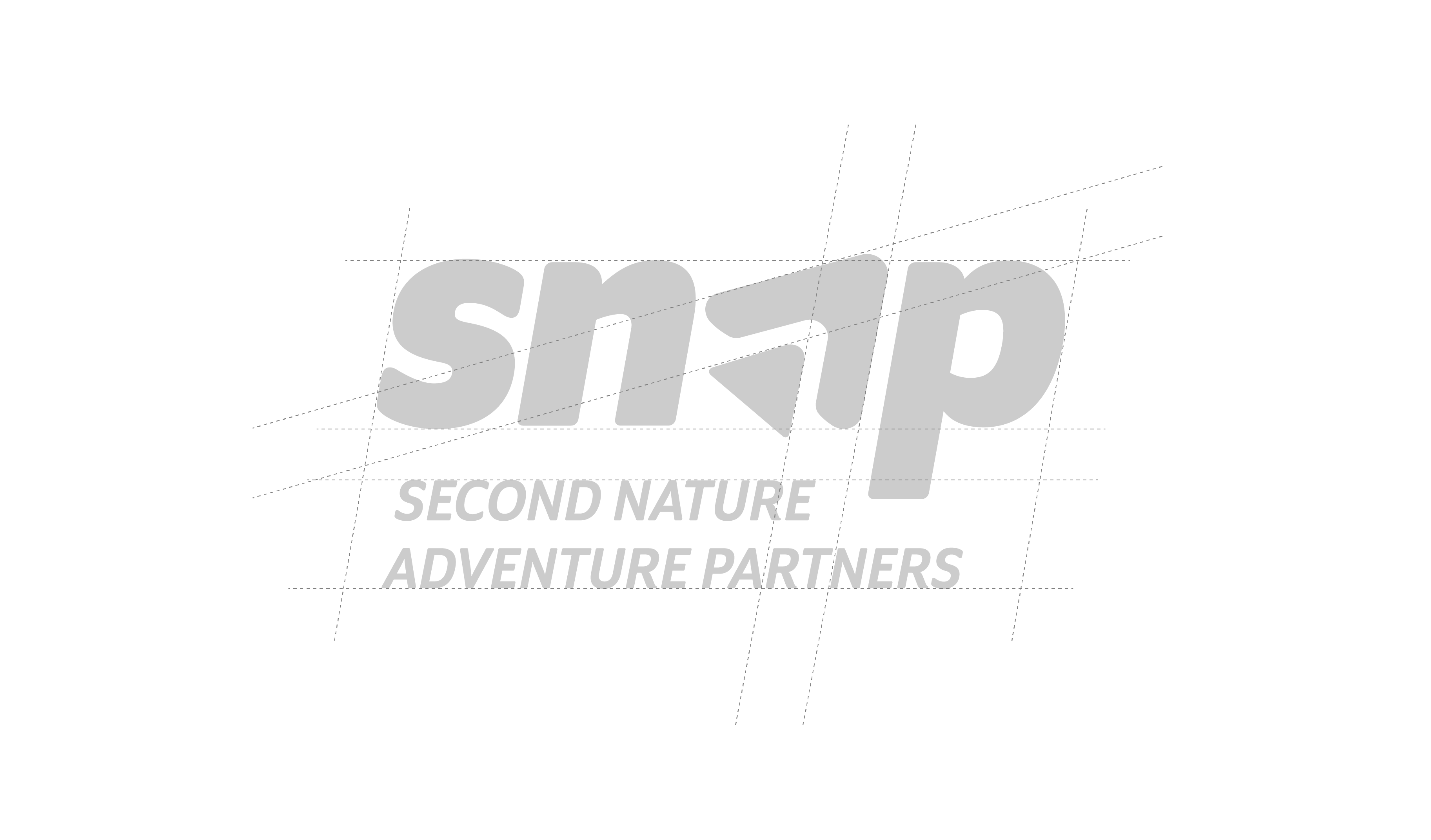
Construction and safe space
Rooted in a commitment to clarity and coherence, every aspect of the logo was carefully considered and meticulously aligned within a grid and spacing system.
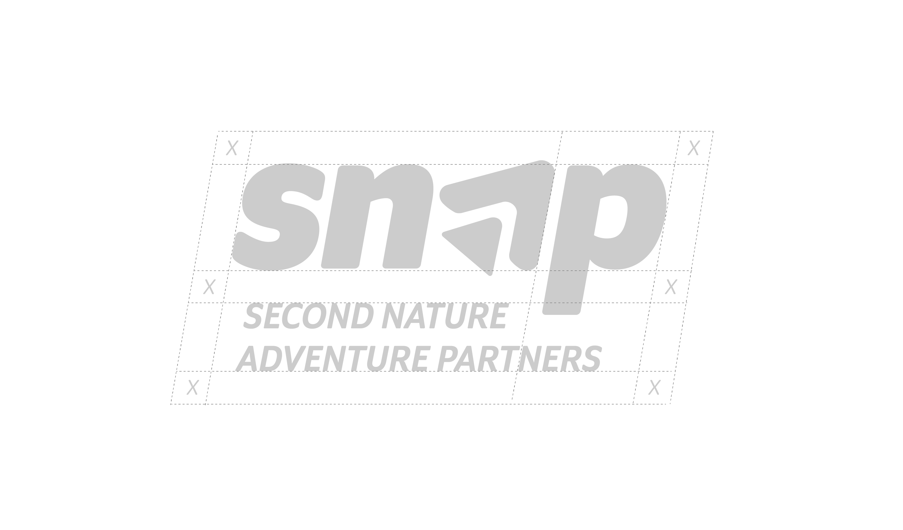
Construction
The logo was carefully crafted and spaced to create clarity and consistency.
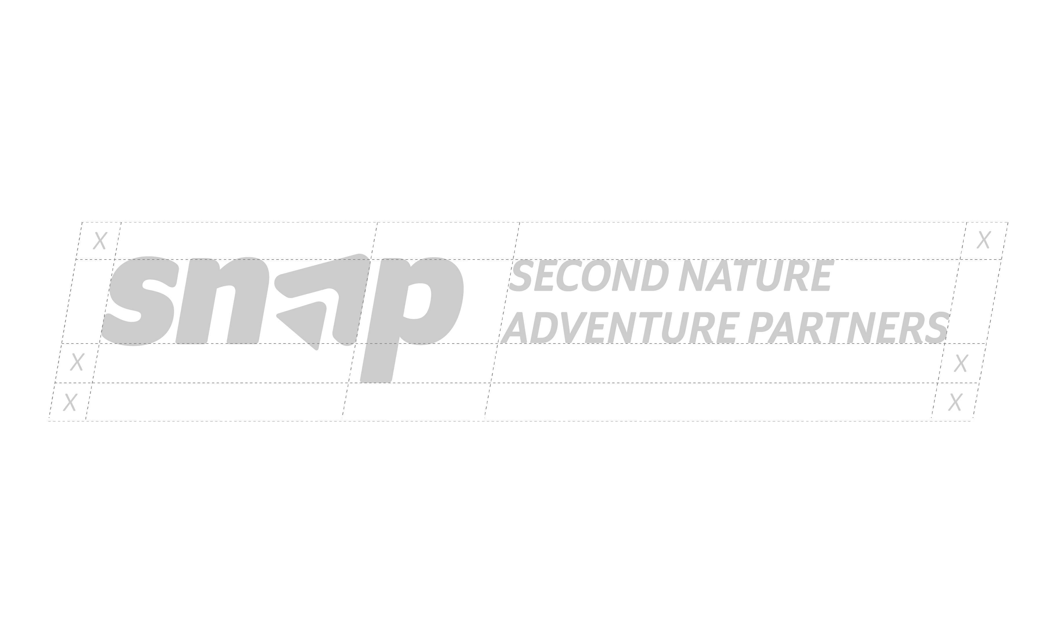
Safe Space
By maintaining a designated safe space, the logo is given room to breathe, ensuring that it remains visually distinct and easily recognizable in any context.
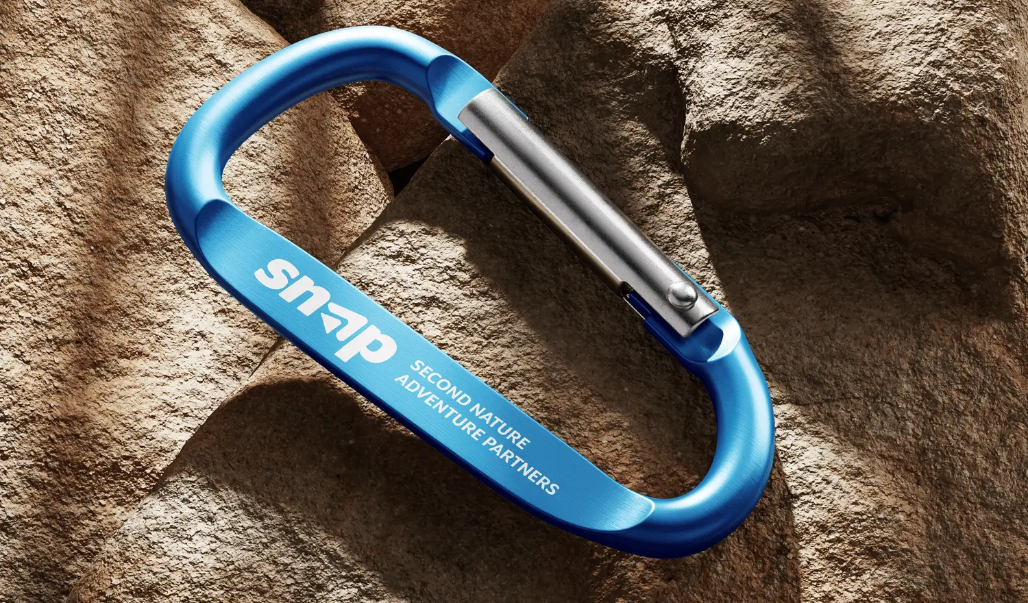
Snap Logo usage
The logo may be used in several ways and it different color variants. The flexibility of the logo system allows for easy usage and impact across all platforms.
Primary Logo
The primary logo used on light backgrounds.
Primary Reverse Logo

The secondary logo used on dark (black) backgrounds.
Secondary Horizontal Logo

The secondary logo used on light backgrounds.
Secondary Horizontal Reverse Logo
The secondary logo used on a dark backgrounds and photos.
Monochrome Logo


Monochrome versions of the logo can be used both in the light and dark version.
Logo Symbol


The logo symbol can be used in white or in the primary brand color.
Downloads


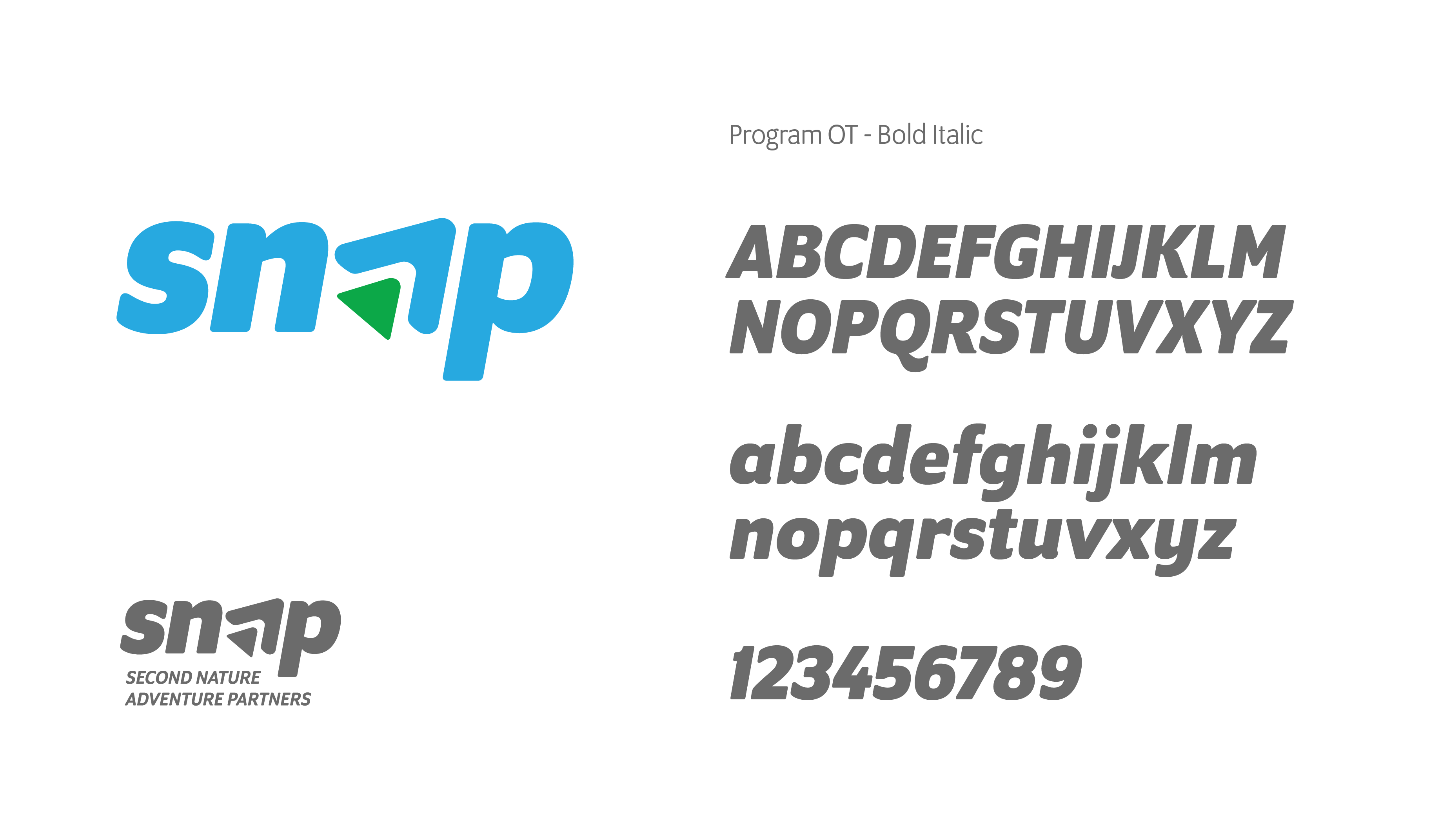
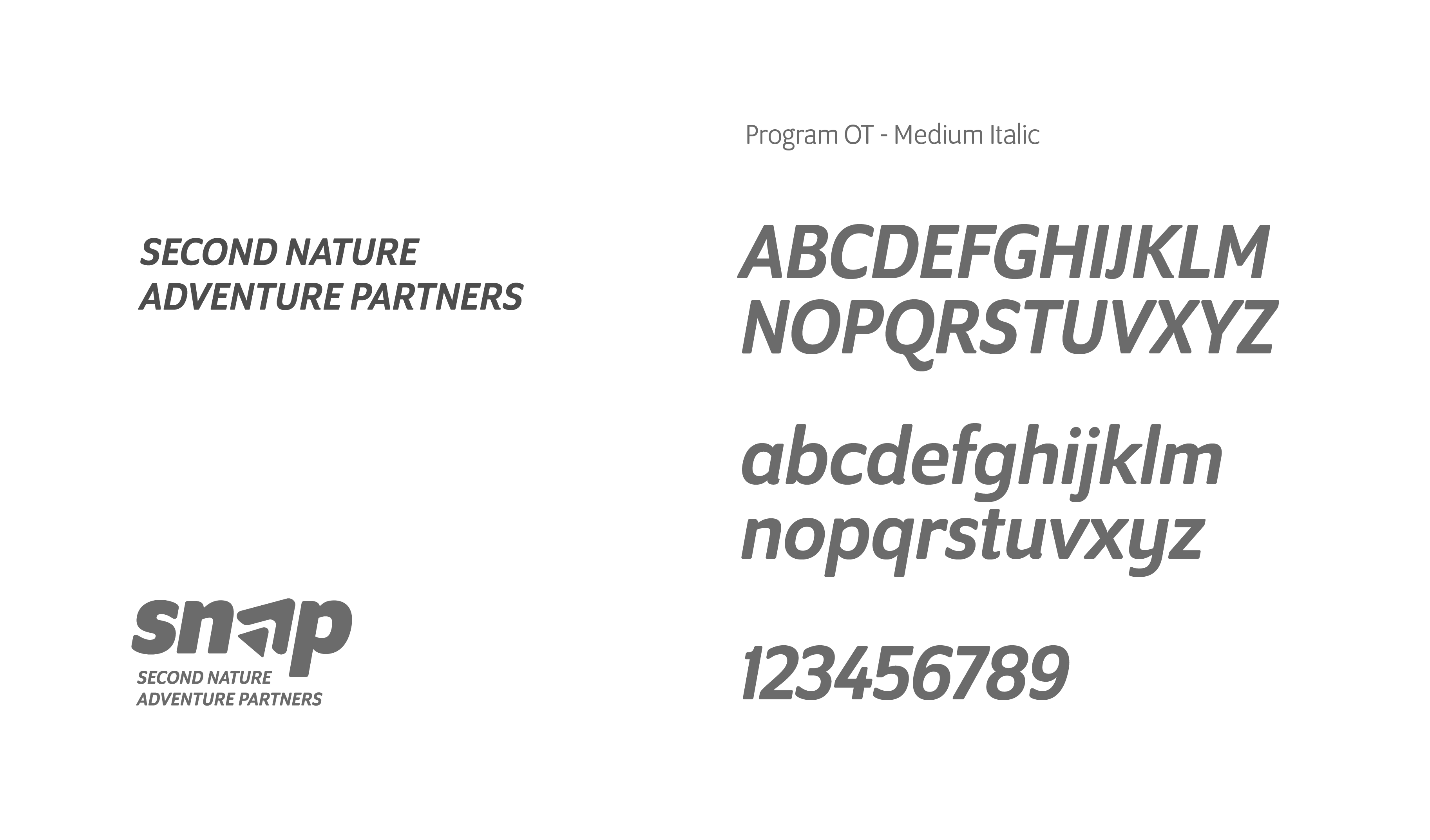
Typography
Typography is one of the cornerstones of our visual identity. A good pairing of fonts and a strong hierarchy ensure maximal visual impact. Beneath you will find information about the typefaces we use.
Primary Typeface
Program is a modern sans-serif collection inspired by a clean, simple and neutral style.The family provides a wide range of weights and stylistic alternatives that can be mixed to create strong branding. Program is used for headings.
Secondary Typeface
Program is a typeface carefully crafted & designed for computer screens. Program features a tall x-height to aid in readability of mixed-case and lower-case text. Pogram is used for all paragraphs and body texts as well as subheadings etc.
Colors
The colors are another essential part of of our visual identity across all platforms. In the following section you will find the primary colors as well as an extended palleted to be used for web.
Primary Colors
The primary color palette consists of 3 supporting colors and one brand color. These colors are used in our logos, on flyers and on social media etc.
Website
Our website is the main touchpoints for our global clients. The look and feel of our website is in line with the overall identity and offers a great set of services, resources and subpages. Our CMS allows internal editors to easily create new and engaging content.
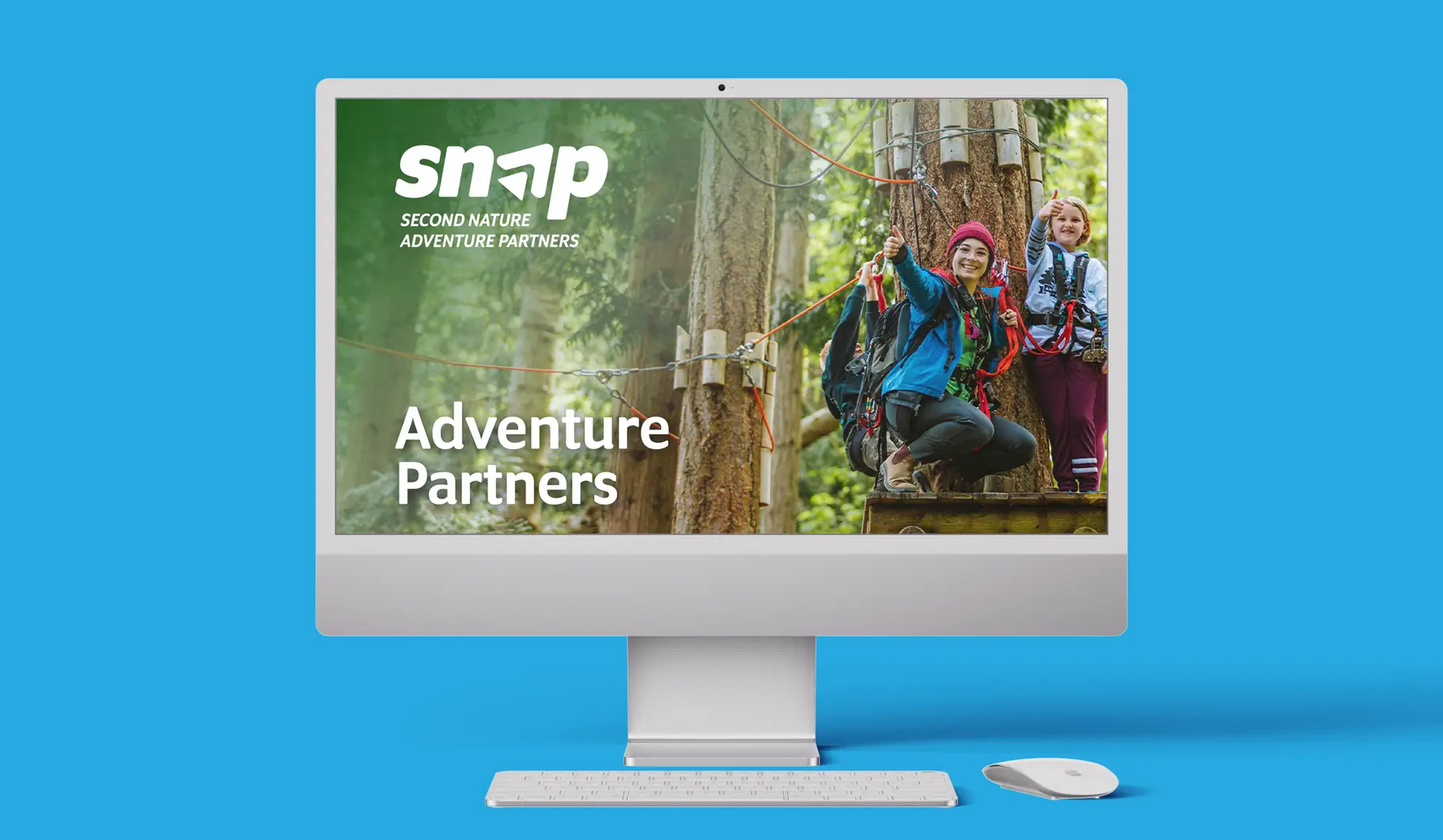
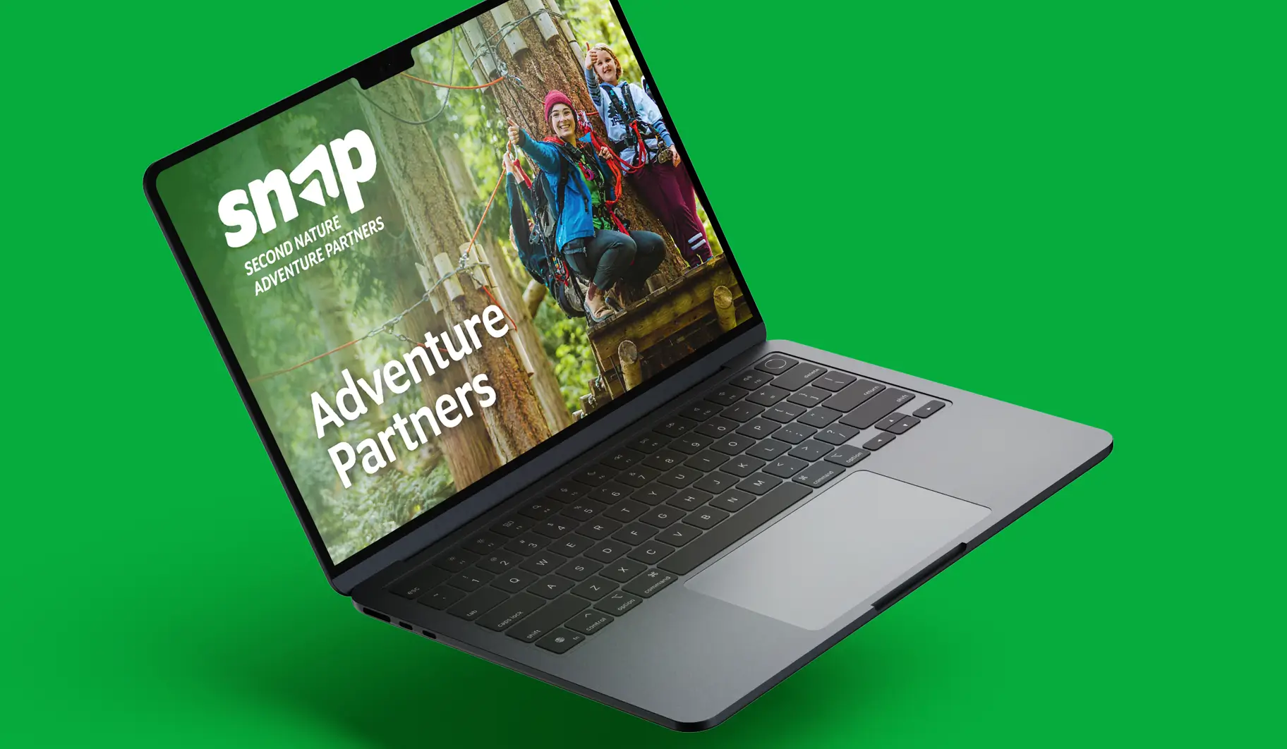
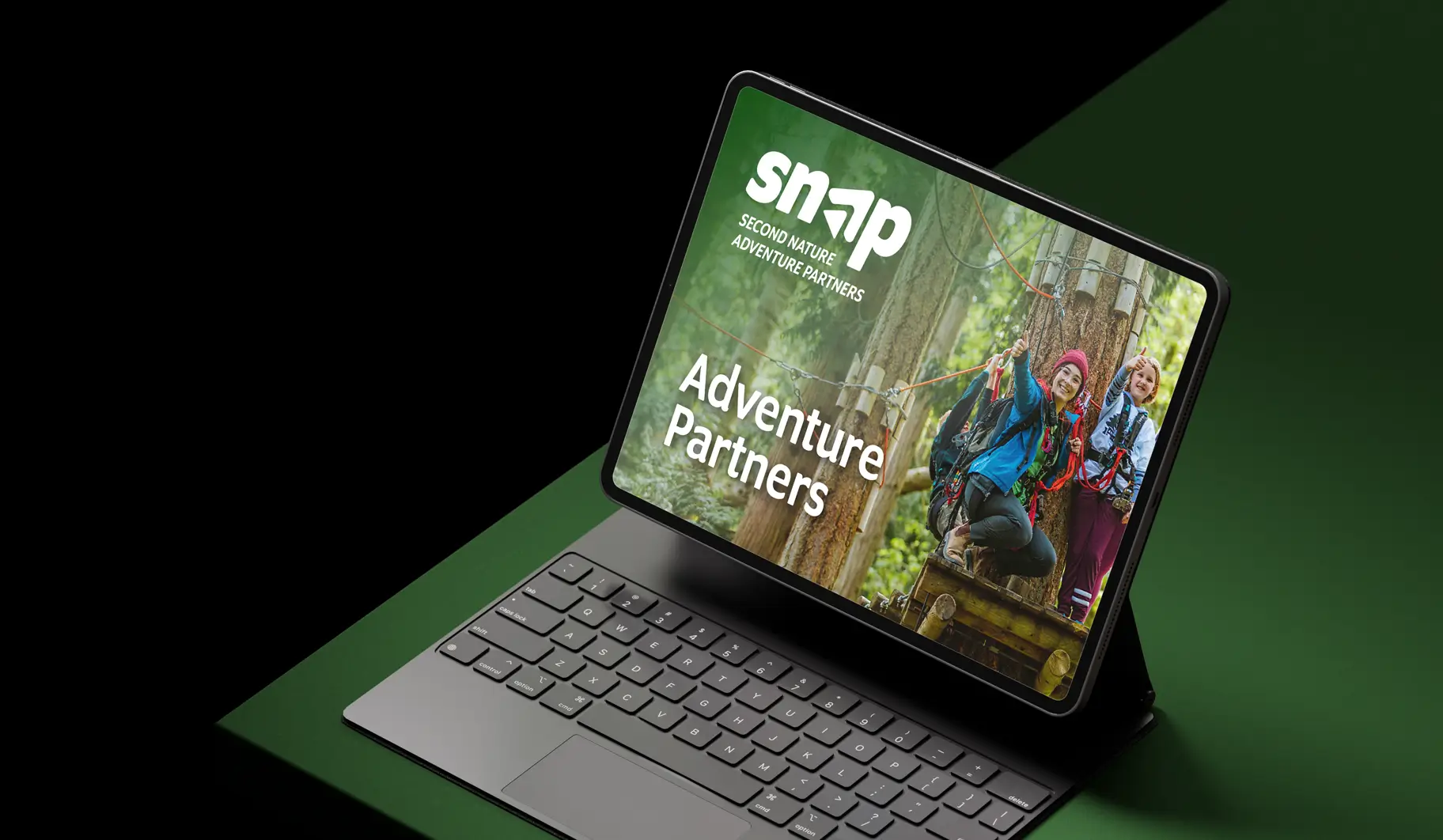
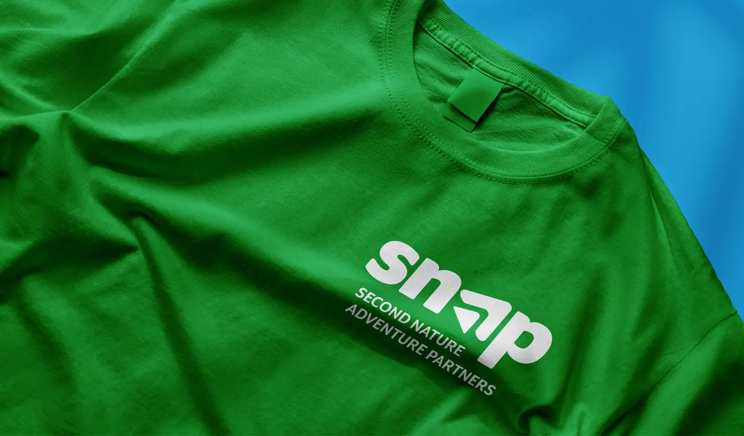
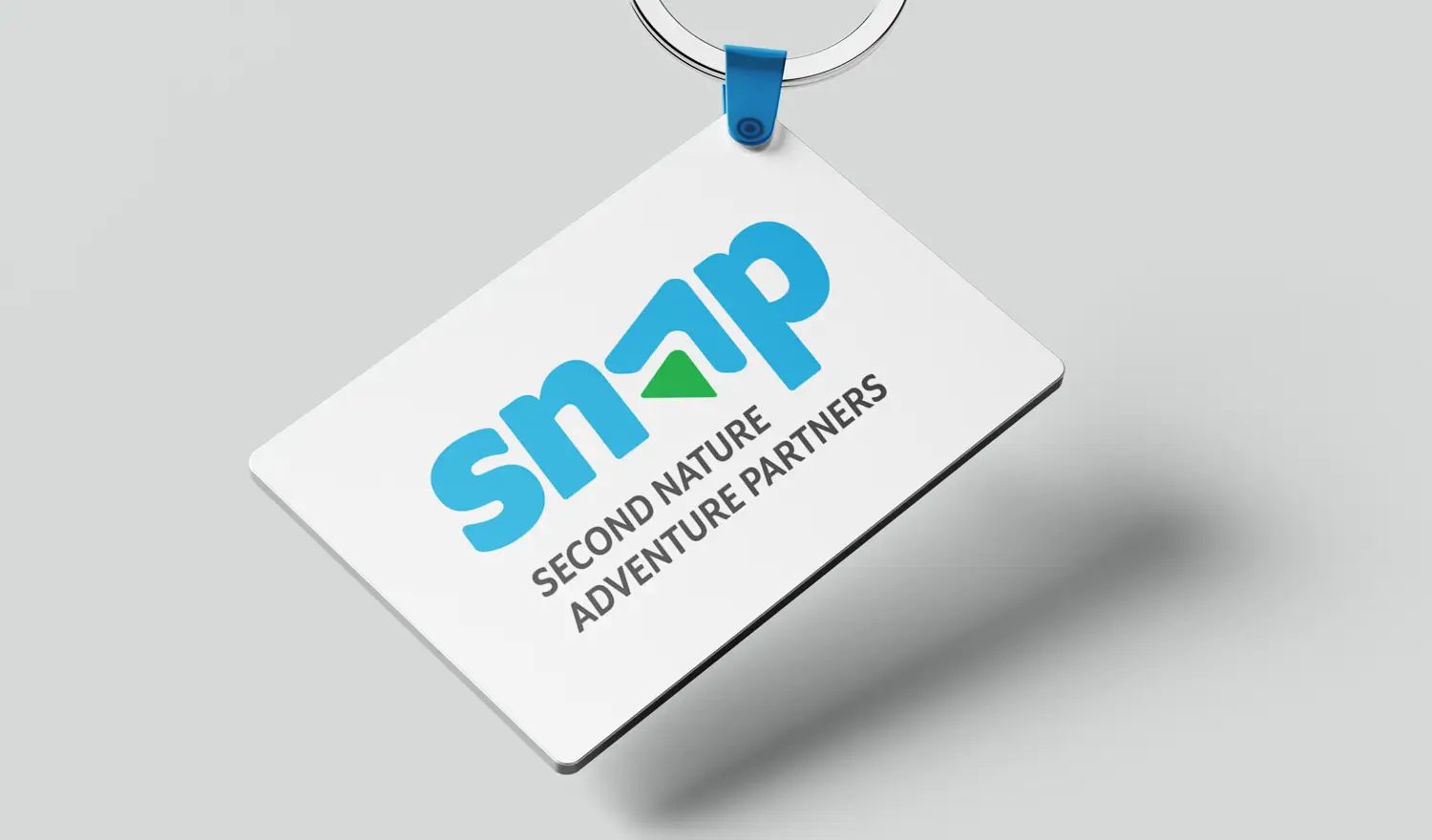
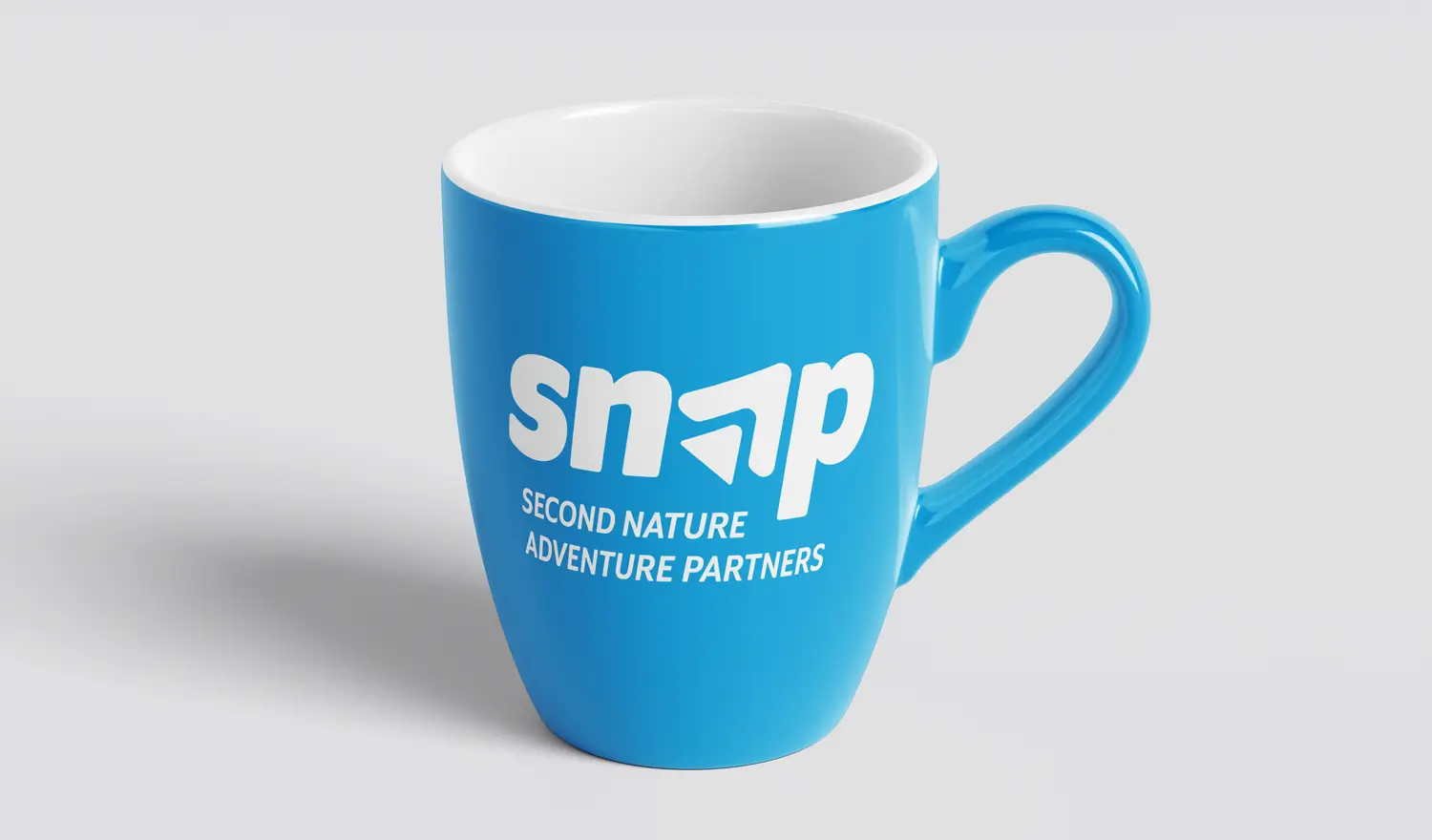
Applications
In this section you will find examples of how our logo and visual identity can be applied to various formats and objects.
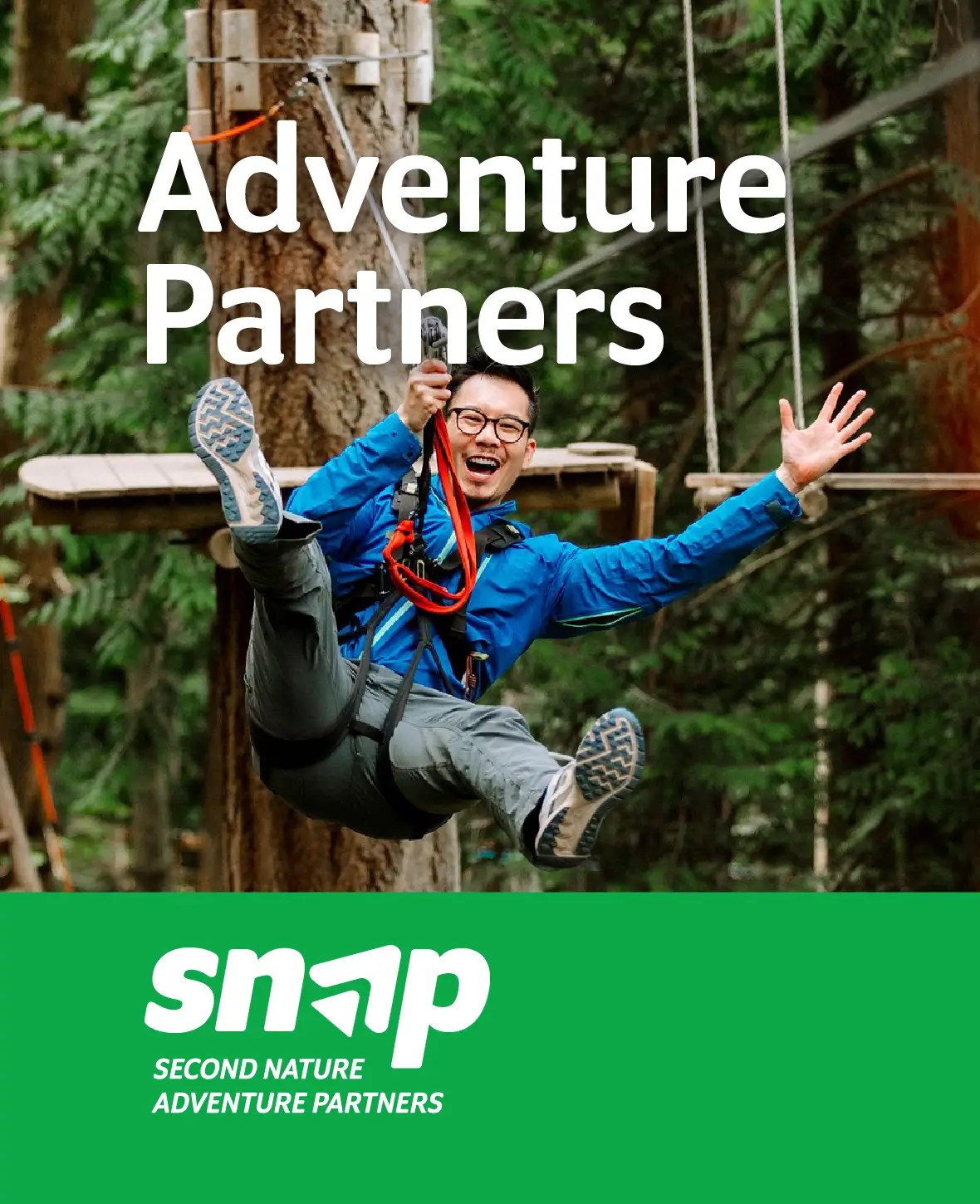
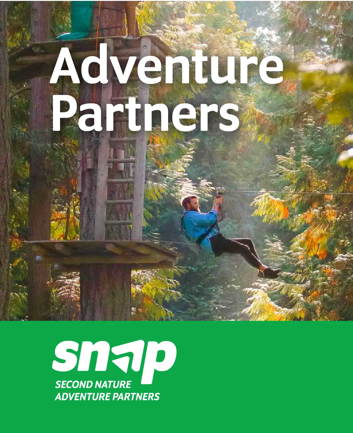
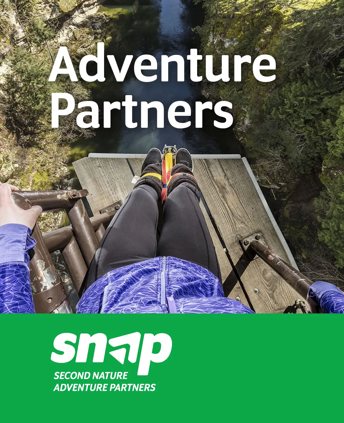
Snap Social Media
In this section you will find examples of how our logo and visual identity can be applied to social media.
Templates
In this section you will find several different templates to download. The templates include proposals, checklists and more.